
Design of the Month
As Featured in the September 2025 issue of
Picture Framing Magazine
History Reflected in Bolection Frame’s Unique Patina
By Jason Fewin
As a small frame shop and art gallery in the Midwest, we probably see a mix of objects similar to what most other shops are seeing on any given day. However, another of our goals is to offer our customers a variety of pre-framed, museum-grade giclée prints framed with what we consider to be styles that are “correct” for the associated artwork.
For example: we recently framed the painting Bouquet of Flowers in an Urn, painted by Dutch artist Jan Van Huysum in 1724. We framed that print with a classic Dutch ripple-style frame. This style was popular in Flemish, German, and Southern European workshops in the seventeenth century. Continuous rows of a wavelike pattern were carved into ebony or ebonized woods. The ripple frame designs were revived in the late nineteenth and early twentieth centuries, when those frames were sometimes gilded.
As we researched various frame styles, we became more and more interested in frame finishes. We learned from the international best-selling book by Peter Frankopan titled The Silk Roads, a New History of the World, that traders traveling the vast network of ancient land and sea trade routes known as the Silk Roads traded in materials such as the metamorphic rock lapis lazuli, which comes from mines in the Badakhshan Province in the remote Hindu Kush mountains of Afghanistan. Lapis lazuli has been used in art by the Egyptians, Babylonians, Minoans, Chinese, Greeks, and Romans. The Sar-e-Sang deposit in Afghanistan is one of the world’s oldest gemstone mines, producing lapis lazuli for over 6,000 years.
In the course of our research, we also learned about another paint color known as Egyptian Blue. We learned that the Getty Museum in Los Angeles is conducting an interesting ongoing research project focused on mummy portraits. Their project, which is known as Ancient Panel Paintings: Examination, Analysis and Research (APPEAR), discusses, among other things, ancient Egyptian workshops, the specifics of wood substrates, and how paint was used by Egyptian craftsmen.
Finally, we learned about Maya Blue. Paint known as Maya Blue was used by the Maya in ancient Mesoamerica, one of the six cradles of civilization (Mesopotamia, Egypt, Indus Valley, China, Peru, Mesoamerica). Art and architecture were very important to the ancient Maya, and the Mexica (Aztec). Maya Blue is one of the most durable of all the ancient Mesoamerican colors as seen in the 1,600-year-old murals at Chichén Itzá, in Yucatán, Mexico. Maya Blue was made by mixing a rare clay called attapulgite with the dye from the añil plant (Maya Blue and Egyptian Blue pigments are available today from naturalpigments.com).
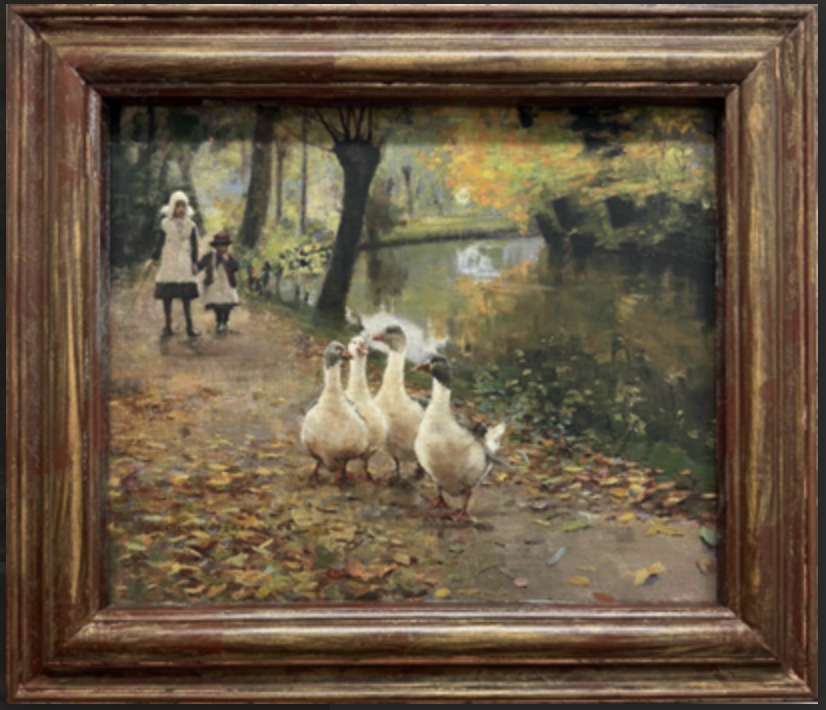
Inspired by all this information, we began experimenting with various finishes on frames that we make in-house. We are featuring one of those custom frames here. The frame is a classic cassetta frame. It is a “bolection” type frame, meaning it has a distinctive ogee molding of reverse section that curves up from the artwork and back to the wall.
Bolection frames were first introduced in Europe in the late seventeenth century. We are featuring this frame, however, primarily for its finish—more specifically, for its patina.
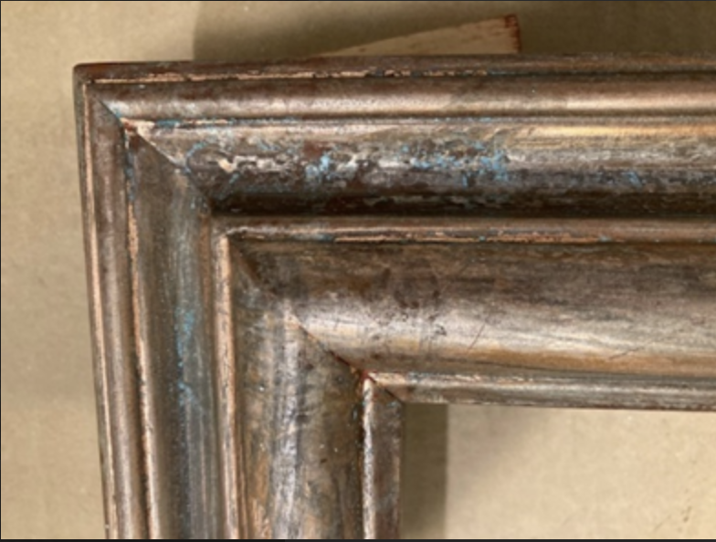
Starting with raw wood molding, we sized the frame to fit the art. We then applied a red, oil-based primer. Following that, we applied size and then gilded the frame with sheets of genuine copper leaf. The interesting and challenging part of this finish was developing a patina to give the frame a casual, aged look.
To create the patina, we mixed an acid with red wine vinegar (yes, you read that correctly!). After some experimenting, we settled on the “correct” (at least what we thought was the correct) mix of chemicals, which we then applied cautiously using a “dry brush” technique. The acid/vinegar solution reacted with the copper, resulting in an aged metallic-look patina; however, our mix was probably a little too strong, and it actually removed some of the copper leaf. In the final analysis, though, the colors in the print seem to work well with the frame’s final aged patina.
As a last step, we sprayed two coats of an oil-based acrylic topcoat with a satin sheen. The giclée print shown is of an 1885 painting called The Intruders, painted by Irish artist John Lavery, who, in the summer of 1885, was the center of attention among the painters of the nascent Glasgow School.